by Ben Johnson - Posted 14 years ago
Responsive web design is a way of creating websites that respond to the different size screens and types of browsers people use to access the web. It is a mobile friendly way to build a website that allows it to render in an attractive fashion without the need to resize, pan, or scroll.
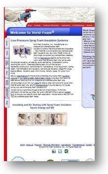
And here is what it looked like on a mobile device:
The new website was designed using Responsive Design, and now looks great on any computer browser as well as any mobile browser. It not only looks great, it also can be viewed without adjusting the screen, panning back and forth, or zooming in and out. This is because the design adjusts automatically based on the screen size.
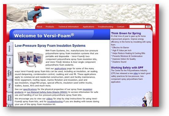
The design will look like this on a computer screen:

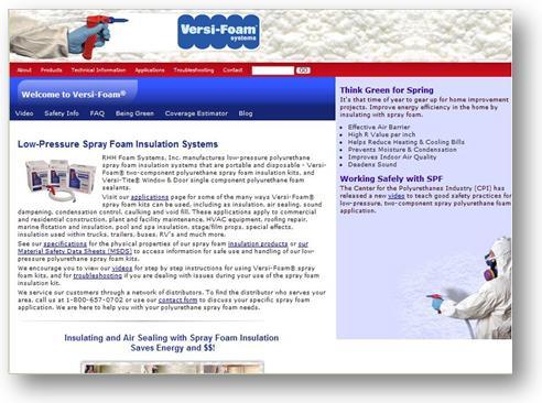
When viewed from a tablet device, such as an iPad, the design will render slightly differently. The left navigation moves to the top of the screen, and the extra space on both the left and right sides is reduced:
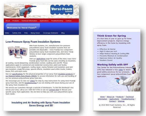
When the website is viewed from a small tablet or e-reader device such as a Kindle, the design will again "respond" to the screen size by adjusting more design elements. In this rendering, the left navigation is on the top, and the right hand column has now been pushed to the bottom of the page. The flash animation of the logo will be removed, saving space and loading time.
An additional size, very similar to the small tablet, will
remove the image of the hand spraying the Versi -Foam for a slightly smaller
screen size:

For users accessing the website via a mobile phone, the website will focus heavily on navigation. The top navigation will become vertical below the logo(the flash animation is absent in this version, as well). The formerly horizontal tab navigation on the left side is now a vertical navigation below the top header Welcome to Versi-Foam, and only the initial subheader is visible. This focus makes it simple for phone users to access the part of the site most important to them, and make the navigation easily clickable. It also lets a user know they are in the right place by prominently displaying logos and headers.
