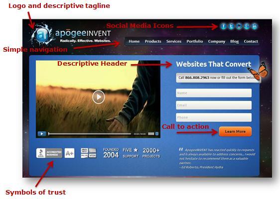
5 Crucial Homepage Features for Website Success.
What are the most important features of a website homepage?
Below we explain the 5 most important elements of your homepage, why they matter,
and how to optimize your homepage for these elements.
1. Consider what is above
the fold
Web users
spend 80% of their time looking at information above the page fold (the bottom
of the page without scrolling). Although users do scroll, they allocate only
20% of their attention below the fold.
Keep the most important elements of your homepage above the fold.
What
should be above the fold:
- Your logo and descriptive tag line.
- Important header(s).
- Navigation.
- Call to action (Sign Up, Buy Now, etc.).
- Social Media Icons and / or newsletter (to keep them connected
even if they don't buy now).
- Symbols of trust. With so many sites on the web, being able to trust a site is one of the top priorities for a user. Include the BBB logo, testimonials, accreditation(s), awards, etc.
People prefer sites that get to the point and let them
get things done quickly. Besides the basic reluctance to read more words,
scrolling is extra work.
However, if you have a long article, it's better to present it as
one scrolling canvas than to split it across multiple pageviews. Scrolling
beats paging because it's easier for users to simply keep going down
the page than it is to decide whether or not to click through for the next page
of a fragmented article.
2. Homepage Text
Content should be skimmable because web users don't read a
lot. Studies show that in a best-case scenario, we only read 28% of
the text on a web page.
Eyetracking
visualizations show that users often read Web pages in an F-shaped pattern: two
horizontal stripes followed by a vertical stripe.
How to make your text easy-to-read:
- Keep headers
limited to encourage reading.
- Use an easy-to-read font, and make sure it is the right size.
- The most important
text should be on the left-hand side.
- Bullet points will ensure more reading, particularly if you bold
the most important parts of the text.
This will also help readers find the keywords they are looking for (and improve SEO).
3. Images
Choose your
images carefully. Don't just throw some
stock image on your page. Users ignore
certain images, particularly stock photos merely included as decorative
artwork. Another eye-tracking study reported a 34% increase in memory retention when unnecessary images were removed
in conjunction with other content revisions.
What you can do:
- Make sure images
you use aid or support textual content.
- Avoid stock
photos and meaningless visuals.
- Be sure to
include ALT tags in your images.
- Headers are more
important than images, so use images sparingly to avoid clutter and confusion.
4. Navigation
Being able to find what they are looking for, very quickly,
is essential to keeping visitors on your site.
7 Homepage navigation
best practices:
- Ideally, you should be able to go to any page
in a maximum of two or three clicks, with your main pages accessible in one.
- A navigation bar can give readers immediate knowledge of the
depth of your site. Just glancing over your navigation links should give them
an idea of what you offer and what's here that they
definitely want to see.
- Top navigation tends to work best, since users read left to
right. This also ensures it will be
above the fold.
- Primary navigation should hold 4 to 5 links to the main
sections of your site. Any more and you'll overwhelm people. For longer
navigation, use drop down lists so users can quickly find the topic they are
looking for (ie Services, Products, etc.)
- Remember that the majority of your visitors
will not land on your homepage - they'll often arrive on a page deep within
your site from a search engine, and therefore must be able to pick up your
navigation immediately.
- Not only
should users be able to get to where they want to go, but make sure they can
backtrack easily. This could mean
including a breadcrumb trail so users can click back to a previous page easily,
and include a link on your logo to take them quickly back to the homepage.
- Include a
search box, as many users prefer to search quickly for what they want if it isn't
immediately visible.
Use these 12 additional navigation tips to give your website
a happy ending.
5. Call to Action
Make sure there is a call to action on your homepage. This could be a newsletter sign up, donate
button for non profits, buy now / shop now for ecommerce sites, or a contact
form. The goal of your website is to
increase sales and build brand awareness, and the best way to do this is by
connecting with your site visitors.
3 Call to Action Tips
to Optimize Conversions:
- Keep your call to
action limited to one action. Don't include both a newsletter sign up and a
contact us form on the homepage, as this will divide attention and lower
conversion rates.
- Make it visually
appealing. Use a color that indicates action and stands out. Make a button so people are more likely to
click it. Just don't make it too
promotional looking, or people will avoid it.
- Use words that convey
urgency. Use words like today, now,
limited time to encourage immediate response.
Does your homepage include these 5 homepage features that are crucial to a successful homepage design? Share your thoughts in the comments below!