Open header designs allow for lots of important whitespace, and help avoid a cluttered feel to the page. This design style also gives websites a more modern look and feel. Below are a few open header style designs selected by the ApogeeINVENT design team to review for design inspiration. See what works and what doesn't in design. Whether you are a web designer, or just want to make sure your website is designed right, use these tips to fuel your imagination.
We hope you find something to be inspired about!
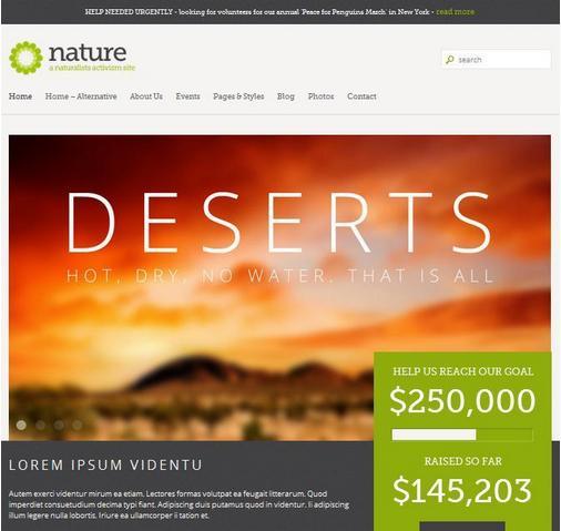
What this design does right:
- Magazine style layout is modern, eye-catching, and encourages further reading.
- Blurred, oversaturated, HDR style background images juxtapose nicely with sharp, crisp edges.
- No shadows and no borders means less clutter and distraction. This goes well with the open header style.
- Green call-to-action (CTA) color is used sparingly and with good effect. This is an example of a good color scheme. Green and earthtones give an overall natural, relaxed feeling, with a brighter green encouraging action.
- Great use of texture in dark bands across page.
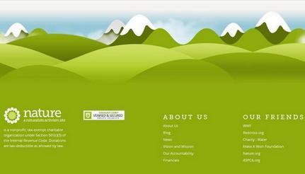
- Beautiful footer.
What didn't work in this website:
- Small navigation with lame (yes, that is a technical term) rollover effect.
- The tagline under the logo is difficult to read.
- No need to use green call to action color on non-clickable dates. Keeping links consistent (same color, underlined, etc.) help the user to navigate more easily.
- Irregularly shaped slideshow images move around the page content below
- The video is lost in the content.
- Call to action is cut off below the fold. Keeping the most important elements (call to action, logo, tagline) above the fold is important, as fewer than 20% of web users will actually scroll down a page.
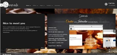
Design Reviewed: Samarcanda
What worked in this website:
- Scripted typeface logo works surprisingly well (although there is the risk it might be hard to read). Content should be skimmable because web users don't read a lot.
Studies show that in a best-case scenario, we only read 28% of the text on a
web page.
- Beautiful depth of field on high-res background images.
- Nicely done slide-in animations on slideshow.
- Due to horizontally scrolling page this works well in a variety of screen resolutions. A good example of out-of-the-box Responsive Web Design (RWD). (Although horizontal scrolling is generally considered a negative, as even fewer people scroll horizontally than will scroll vertically.)
What doesn't work in this website:
- As mentioned above, horizontal scrolling page is kind of awkward and takes getting used to- there is the risk that the content will be overlooked.
- Navigation and footer text is super tiny. Ease of navigation is one of the most important elements to keeping a user on the page.
- Background images are different shapes, which creates ugly changing border widths.
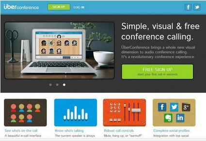
Design Reviewed: uber Conference
What worked on this website
- Super smooth icon animations which don't use flash (they are .GIFs, so loading is faster) and draws the eye to the different elements of the page.
- Nice texture in darker area.
- Nice use of chartreuse call-to-action (CTA) color. Somehow it stands out from a very colorful site.
- Consistent use of modern, simple sans-serif font
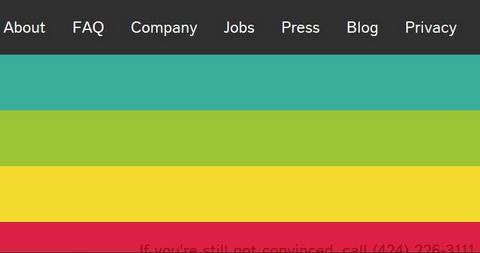
What doesn't work on this website:
- Rainbow footer is distracting and odd
- Phone number in footer is nearly unreadable.
- No navigation at top, and bottom navigation is uninspired. A huge negative, because many people will leave the page if they can't immediately find what they are looking for, and the best way to navigate there.
- Completely 2D except for the non-clickable monitor image.
- Video doesn't automatically enlarge and doesn't provide a full screen button.