Today we review another web design that was NOT designed by ApogeeINVENT. Reviewing sites around the web helps us stay sharp on what good design is and is not. Our notes are below.
- grey background looks old fashioned
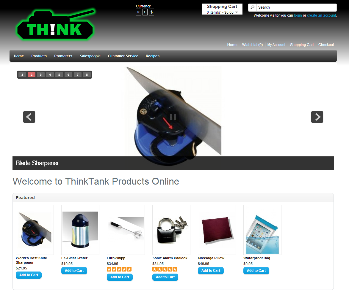
- heavy handed gradient does not represent a light source as it should
- slideshow transitions are eye catching and unique
- some of the images in slideshow appear low resolution
- - recommend replacing with high res stock photography
- can use slideshow area to tout specials and company trust, rather than just products
- slideshow seems to stop at slide 6
- smaller text on page should be greyer than larger text which should be blacker
- no single call-to-action on the page
- - what do you want the visitors to do next if only one thing?
- logo looks sharp and is very brandable
- currency switcher at top appear to work as intended, however it is located in a prime location
- - perhaps move down into product sales area and leave the top header for company branding
- - - same with search box and shopping cart
- navigation bar has reverse gradient as top header, but the lighting source makes sesne
- nav bar dropdown has nice animation and mega dropdown content
- breadcrumb trail works well and is presented well
- cehckout link is too small
- - once items are in cart the call-to-action should be a checkout
- big usability error: clicking on Checkout link with an item in cart results in an empty shopping cart message
- - no way to purchase?
- overall the layout is clean and the content is decent, but the usability and theme could use modernization