[Updated 10/29/2020]
Halloween is upon us. That means candy, costumes, and pumpkins.
Even during the pandemic, we're still excited to celebrate. Or at least spend money.
The National Retail Federation's Annual 2020 Halloween Spending Survey released on Tuesday showed just 58% of those polled said they were planning to mark the occasion, but they still expect to spend a record $91.12 each, up from $86.27 last year, the most since the survey started in 2005.
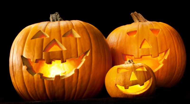
One of the most common symbols of Halloween is the jack-o’-lantern.
The practice of decorating “jack-o’-lanterns”—the name comes from an Irish folktale about a man named Stingy Jack—originated in Ireland, where large turnips and potatoes served as an early canvas. Irish immigrants brought the tradition to America, home of the pumpkin, and it became an integral part of Halloween festivities.
How does this relate to marketing? As I was carving Halloween pumpkins this year with my kids, I noticed how there are some important similarities in how I designed the images my children chose to fit on the pumpkin, and the logos we choose to represent our businesses.
4 important logo design tips inspired by pumpkin carving:
Simplicity is best.
Ever tried to carve an intricate pumpkin? Many times an image that looked great on paper just doesn’t quite look the same on a carved pumpkin.
Too much detail in a logo means it will be difficult to translate onto your marketing materials. You need an image that will look great on a billboard and a business card; on a digital website or print letterhead. The best way to ensure your logo is going to look great on all your marketing materials is by keeping it simple.
Let’s consider McDonald’s iconic logo. The Golden Arch can be seen on the top of a pole, or on the wrapping of a Big Mac.
Another great benefit of a simple design? People can more quickly identify it, and recognize your business.
A logo needs to make an immediate connection.
If your audience doesn’t recognize what you’ve carved in the first few seconds, you’ve failed. In the same way, your logo needs to immediately make an emotional connection with your audience within the first few seconds.
The color or image choice you make needs to tell your audience what your business is about. Think about Apple’s logo. The apple with a bite out of it is simple and flat, which looks modern. The bite missing from the apple is there to give the image scale when reduced in size, and helps
fulfill the golden ratio.
Most people will recognize the logo immediately, no matter what size or color it appears.
Negative space is important.
In pumpkin carving, the negative and positive space must work together to create the overall design. When designing a logo, space is limited. That is why it is important to realize that negative space can be an important part of the design. You can think about using negative space in a logo in the same way you need to utilize the space carved out of the pumpkin.
These small nuances can make a simple logo really stand out.
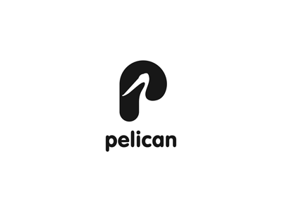
Here is one example of how negative space can be used in an advertising agency logo,
Pelican.
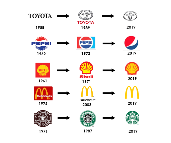
Logos degrade or become outdated.
We all have made the mistake of carving a pumpkin too early, and throwing out a blackened, curled up remnant of our masterpiece the day after Halloween. While we might hope a simple logo will be timeless (and sometimes can be), it is important to remain relevant.
Color or symbol choices might take on new connotations over the years, and giving your logo a little facelift might be good.
Here are some examples of how popular brands have updated their logos over the years. Just keep in mind that a little bit of change over time is good, but frequent big changes can make it hard to relate to your business and keep a consistent brand message.
Thanks for humoring me and my love of all things Halloween. Have a wonderful and safe weekend, even if it’s spent in the dark hiding from trick-or-treaters. Happy Halloween!