by Lindsey Winsemius - Posted 13 years ago
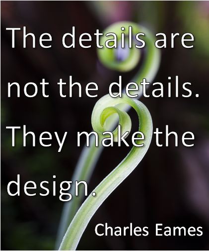
5 web design details that are overlooked:
Shadows. You've picked great images and the perfect readable font. But something isn't quite right. One common design mistake is to use shadows
from different angles. All the shadows
should be in the same direction. Pretend there is an invisible sun - where
should all the shadows fall? A
discrepancy in shadow might not be easy to pinpoint, but it can make the whole
design look off.
Square vs Rounded. Many web designs use 'boxes' to separate
out the different sections of the page. Or they include buttons. But something
that is often not considered is the corners. Using consistent rounded or
squared corners is important to the cohesiveness of a design. Checking to be sure the corners are
consistent is important to ensure a beautiful design.
Depth. Sometimes a web design
will have a mixture of 2D and 3D elements. Or perhaps it has a
background that looks like a realistic scene in the distance, but a foreground
that could never exist in that situation. Designing a website is all
about user experience, and you don't want a use to be viewing your website with
skeptical eyes. It can influence how they view your business.
Alignment. Header not quite centered? The boxes of the
webpage are a little uneven? Good enough, some designers might say. But even the slightest off-centered header,
or misaligned sections, can make the page look skewed. And even if the user
can't put their finger on what is wrong, it can give them a bad first
impression, and make them feel uncomfortable with your overall design. The end
result? They will have a negative feeling towards your business and will be
less likely to perform whatever action your web page was built to inspire.
Cohesiveness. This
could be the wrong colors in the color scheme, or too many colors. It could be fonts that are too different to
be paired on the same page. The images might not follow the theme. These issues can be easy to overlook, but can
make a big difference in the overall feeling the user is left with.
Whether you are a web designer or just a website owner, it
is important to pay attention to the details of your website. Don't lose a
customer because of sloppy design or an overlooked error.
Know of other web design details that are often
overlooked? Please share them in the
comments below!
 by Lindsey Winsemius. Lindsey is the Vice President of Communications for ApogeeINVENT, and is the social media voice and blogger for the company. Follow her on Twitter or connect with her on Google+
