by Lindsey Winsemius - Posted 6 years ago
Humans are complex and interesting beings. We are influenced and motivated by all sorts of things like smells, emotions and even colors. Marketing gurus have long tapped into the psychology of this and used it to their advantage.
There are many different things that can be used to influence existing and future customers. In fact, we could be here all day talking about the various tactics you can implement to capture the attention of your audience. But for now, let’s focus on colour.
So how does color affect human behavior and how does this help when it comes to marketing?
Put simply, colour psychology is the research of how colours influence our behaviour and decision making. Certain colours evoke certain emotions or reactions which can be used by brands and marketing specialists to influence consumers.
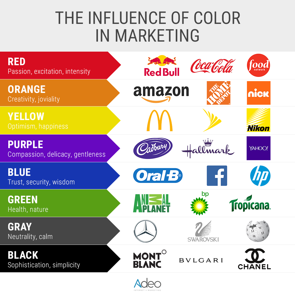
There are so many colours in the world and so many shades and hues to choose from. Here are some of the most popular colours used in marketing:
Red
Red is a bold choice as it can cause strong negative and positive reactions. It is used a lot in sales as it creates a sense of urgency. It also is known to trigger hunger or encourage appetite which is why you might recognize it from several high-profile food brands.
Blue
Blue is a very popular colour so standing out amongst competitors may be challenging if you choose this colour for your branding. It is, however, popular for a reason. It has a calming effect on consumers and is regarded as a colour of wisdom, strength and trust. According to a study by Iconic Fox, 57% of men cited blue as their favourite colour.
Orange
This is associated with fun and warmth as many associates it with the sun or with a cozy autumn. It is also the colour most people associate with “cheap” which can be a positive or a negative depending on what you are selling!
Yellow
Yellow also represents warmth, optimism, fun and youthfulness as it is associated with sunshine. It’s also most powerful when seen in contrast with a darker colour. This may be why many company logos have a black font on a yellow background.
Purple
Purple is associated with superiority and is often used by brands when they want to seem important or distinguished. Tints of purple are also associated with creativity and femininity and can, therefore, be used to target female consumers.
Green
Green is predominantly seen as a positive colour linked to health, wellness and nature. It is also seen as a strong and bold colour.
Magenta
This is widely used to portray youth and/or femininity. It represents hope and offers comfort which makes it a positive colour to use in your marketing strategies.
Black
Black is powerful and luxurious. Bold and simplistic, it is often used by high-end fashion brands. Used well, it can portray sophistication, elegance and authority but used in the wrong context it can come off as cold and oppressive.
White
White is modern and simplistic. Executed improperly, it can come across as tacky or lazy but used correctly it looks smooth, sleek and represents cleanliness.
Every aspect of your branding should take colour psychology into consideration. Although much of the reaction may be subconscious, it has a powerful influence on how people perceive and react to your brand.
Some areas to think about utilizing colour psychology are:
- Company logo
- Product logo (if different from your company logo)
- Banner Ads
- Landing pages
- Call to action buttons
- E-mail blasts and newsletters
Although your company logo is likely to stay the same, you can play with various colours and palettes when marketing. For example, if you are a retail company selling various products but have a sale on high-end art supplies, you may wish to utilize purple as it symbolizes both creativity and luxury. Or if you are hosting an autumn “everything must go” sale, consider using orange to highlight the cheap prices and capitalize on the feeling of sun and warmth at that time of year.
You can explore various colours depending on your target audience and the products or services you are selling. You may even want to make the same advert available in different colours to target specific demographics separately.
Let’s look at a vegan burger takeaway company as an example.

The white logo symbolizes cleanliness and a modern approach to food whilst the black background is powerful, elegant and authoritative. Used together, the black and white colours create the sense of modern and youthful elegance.
Black and white are used with text and infographics throughout their landing page to highlight their sustainable approach to fast food. They also use a pop of green next to the other black and white infographics to highlight their commitment to reducing plastic waste. As mentioned above, green is considered a positive colour associated with health and nature.
These logos and infographics are placed in front of a background of photographs of their various foods and restaurants, most of which are using a palette of orange and yellow which represent warmth and youthfulness which creates an inviting tone overall.
Colour psychology is a truly fascinating part of marketing. You might need to play around with different colour palettes to find out what works best for you and your customers so don’t hesitate to switch things up and check in on how your marketing strategies are performing with each colour scheme.
There are endless options when it comes to colour psychology so have some fun with it and don’t be afraid to get creative!