I was recently asked “What is the most important part of creating a successful landing page – design, forms, or copy?”
That was a tough question to answer. I finally had to answer using a favorite design quote of mine: “The details are not the details; they make the design.”
Furniture designer Charles Eames said that, and I think it is very relevant to web design. What do I mean by that? Every aspect of the landing page contributes to the first impression a visitor has when they land on your page. Studies show that people form an impression in milliseconds, based on the overall design of the page and how each element comes together.
After the initial impression, visitors will glance at your logo, and then key images can be used to direct the eye to header and your call to action. By using science and art, a good landing page combines all elements (copy, images, forms and overall design) to turn that visitor into a lead or sale.
Let’s take a step back. What is a landing page? A landing page is any page on your website or a dedicated landing page (which is usually a single page website for a product or service) that visitors arrive at or land on from another source. That could be a link from your social media campaign, an ad you put on Google, or just from the search result page.
If you’re selling a product or service, every product page should be looked at as a landing page. We build many landing pages, for our services and for our clients. Over the years, we’ve learned that while design trends may change, what drives people to make a purchase or fill out your form stays basically the same.
Here are the basic elements for a successful, modern landing page design:
1) Color Scheme.
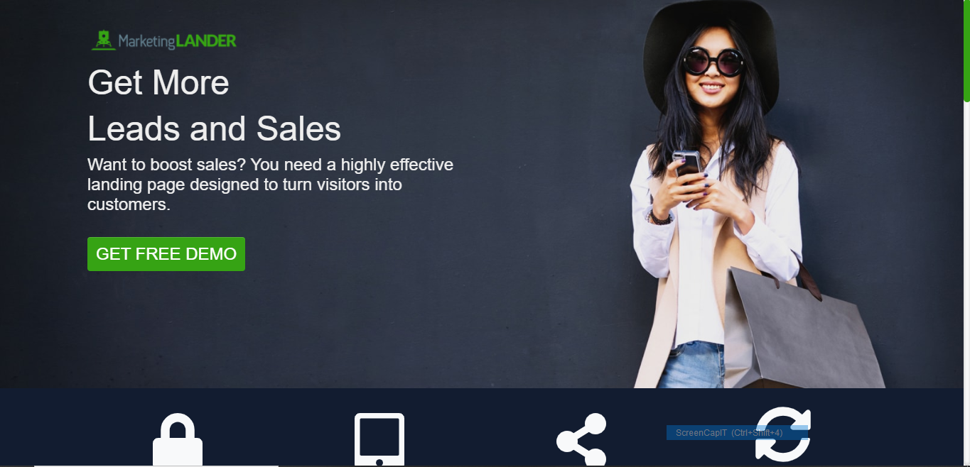
Choose a color scheme that matches your branding. Avoid too many colors that distract from the main purpose of directing the eye to the main header and the call to action button. In this example that is also featured in our
landing page case study, we use mainly blue, yellow, and grey to match the branding, even choosing images with primarily blue.
2) Form or Button
This is a common question- should a landing page include a form or a button? We’ve had more success with buttons in recent years, since they look better on mobile. However, everything is worth testing for yourself, since this can often depend on your product / service and audience.
Whichever you choose, here are things to keep in mind:
The form should ask for a little information as possible. Long forms discourage people from filling it out, and asking for personal information, like a phone number, if you don’t really need it can also scare people away.
Your button should stand out from the rest of the page. Use either a contrasting or complimentary color that will draw the eye. See how the green button really stands out on our landing page for our product MarketingLander?
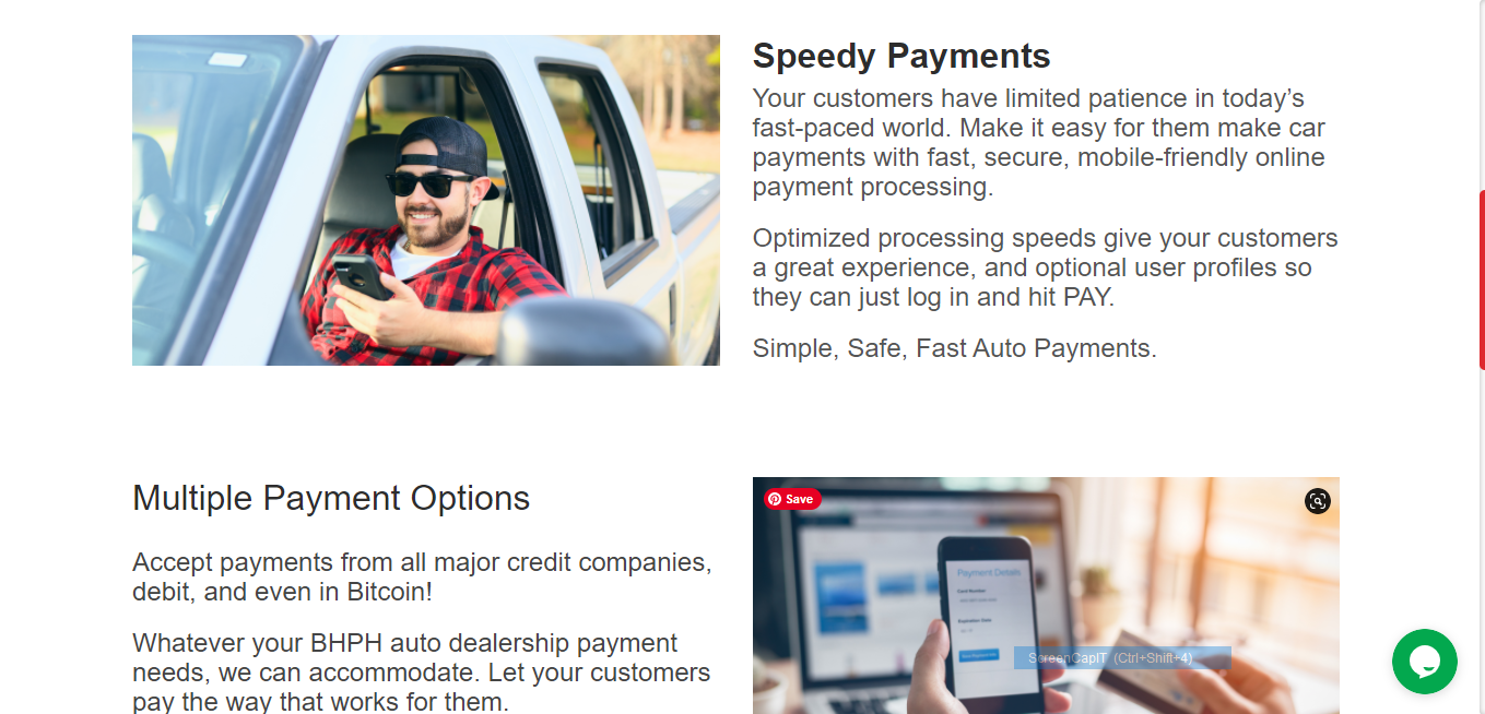
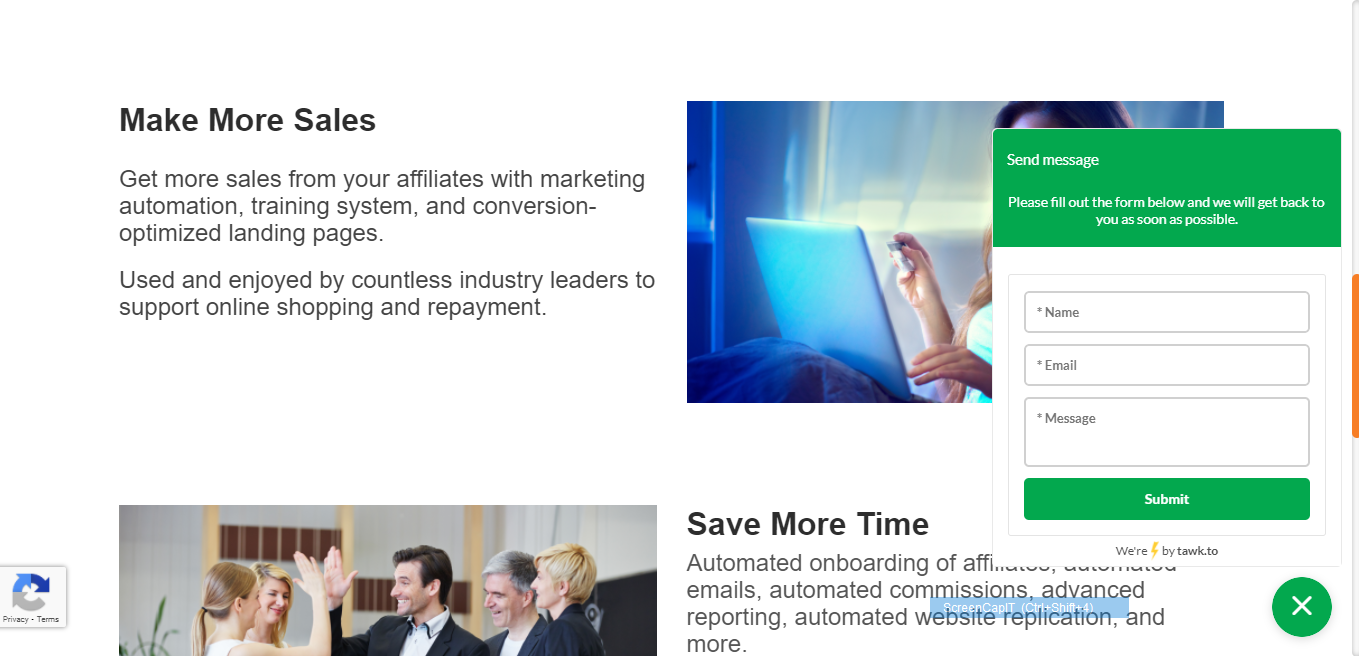
3) Keep images to a minimum.
A few simple, well chosen images can be used. What do I mean by well-chosen? The images should direct the eye to your form / button, or be used to convey the main benefit of your product or service.
For example, if you’re trying to get more business for your snow removal service, don’t use a driveway full of snow. This makes people feel anxious or upset. Instead, use an image of a perfectly plowed driveway with happy people (preferably looking towards your Call to Action, if possible, to help direct the eye there.)
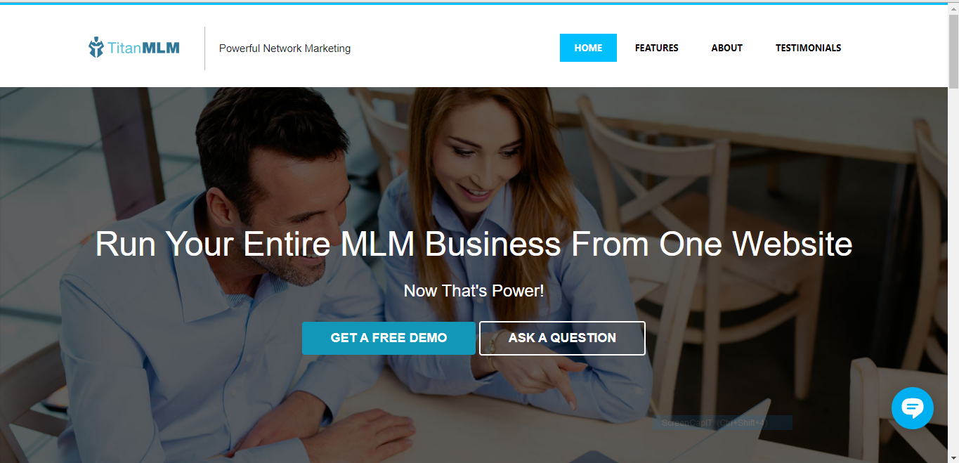
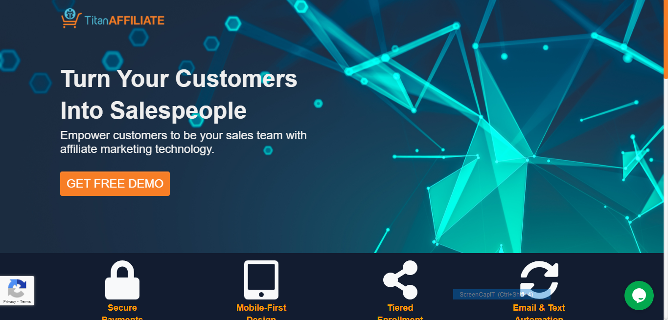
In this example of our TitanMLM product landing page, the image depicts happy users and their gazes direct the visitors' eyes to the call to action button.
4) Only include one Call to Action
Your landing page should be dedicated to one thing only – purchasing a product, requesting a demo, downloading a free guide, etc.
Don’t try to sell more than one product or include a blog. These are all distractions.
You CAN include more than one place on the page that asks the visitor to take action, just be sure every button or form matches, and that it encourages the user to take the same action every time.
5) Write Great Headers
Your heads should tell the entire story. Visitors to your landing page should be able to immediately see the benefits of your offer by skimming your headers. Keep your headers brief and descriptive of the content contained within each section. Subheaders and paragraph text should only be there to explain the point made in your header.
Keep in mind that most people rarely read all the text on your page. They will often skim headers, and only read sections they are interested in knowing more about. If you don’t have great, descriptive headers, most visitors will miss the point.
6) Choose persuasive power words.
If you use these free power words, you will instantly get more leads because they work so well.
There are certain words that have been identified as the most persuasive words. These words are the ones you will want to incorporate into your header text or on your call to action buttons.
They are also great to use in your autoresponders.
What are these magical words?
7) Use “symbols of trust”.
Getting visitors to trust you with their personal information is one common barrier to overcome. How can you get visitors to trust you without all the trappings of a full website? Use common symbols that convey trust. That could mean awards, recognitions, business bureau ratings, Google or Amazon ratings, etc.
You can also include a testimonials section that highlights how other customers have enjoyed your product or engaged with your brand. Using names or business logos will help to make these testimonials more authentic and real for the visitor.
8) Use an email autoresponder.
Don’t stop at the conversion. Once someone fills out your form, solidify your connection with an autoresponder. An email autoresponder has the highest open rate of any kind of email. Whether you’re thanking them for a purchase or sending them a thank-you for requesting a demo, that email is an important step in turning that contact into a loyal customer.
9) Consider chat.
If you are able to allocate the resources (mostly time to monitor the chat), consider incorporating a live chat button on your landing page. This becomes an optional immediate-response call-to-action that in today’s instant society, many people have come to expect.
This is a good way to removes barriers to purchase or filling out your form by addressing concerns and forming a connection.
10) Make it mobile.
I almost didn’t include this tip because I feel like, by now, this should just be a given. Anything you’re putting online should be mobile-friendly. For a modern landing page, this means optimizing for load speeds (under 2 seconds is ideal), avoiding images or elements that lose their impact when they are rearranged in a responsive design, and using the correct size for text.
Think you could use a landing page to get more leads or sales? Want to run a Google Ad or Facebook campaign and not sure where to send traffic? Get the most from your campaigns with a dedicated landing page!
Ask us about our MarketingLander product, designed by professionals to get you more leads and sales.