Just having a website is no longer enough. In the highly competitive digital world, you need to stand out and immediately connect with your audience. A great website design is the first, most crucial step in attracting people to your website, and convincing them to hang around long enough to potentially become a customer.
What makes a web design "great"? Using a combination of art and science, a great web design gives the user a great experience (we call that UX Design), it tells your brand's message immediately, and it uses modern design methods to do it.
Here I am going to talk about the look and feel of your website. We will save the technical discussions of mobile frameworks and core web vitals for another article.
Do you need to incorporate every new trend into your website? Of course not. Pick the trends that will really appeal to your audience. That can help you tell the story of your business. Some trends are going to be fleeting but can help you be more competitive right now. Other trends are timeless and can be part of your overall branding for a long time.
Ask your web designer or pick the trends that best represent your brand.
How often should you update your website?
You should update your website every few years.
This doesn't mean a major design overhaul. Sometimes you can keep the design, but it may need to be updated to a new mobile framework. Or you may want to freshen up the design by getting rid of trends that were popular but are no longer in vogue. Sometimes browsers no longer support certain functionalities, like when Chrome started blocking flash players by default.
There are many reasons you might want to update your website on regular basis. Make sure you are regularly testing links, forms, and the navigation of your site for things that can break over time.
You can see here the many designs we have gone through since 2004:
How do I know when to update my website?
If you're looking around for popular design trends or questioning the design of your website, it is probably time to consider an update.
You can usually tell when your website isn't measuring up. Perhaps your leads or sales are falling. You aren't ranking as well in search results. Maybe you have broken elements, like forms or animations that aren't working.
These are all signs that your website could use an update.
How to update your website
Whether you want to do it yourself or are looking for a professional to update your website, knowing what trends you like and don't like is a good first start.
If you're thinking of updating your website or building a new one, these are the design elements to consider:
Popular Web Design Trends
Parallax
Parallax helps give your site depth and movement. You may have seen this design without even realizing it. Parallax scrolling is when the foreground scrolls at a slower speed than the background, creating 3D feel.
This can be appealing, but if overdone, can be distracting from the core message you are trying to deliver. Use parallax sparingly and it can be a beautifully simple addition to your design.
Interactive Content
Design is becoming increasingly complex, and users expect to be given more information at a glance than ever before. This is where interactive content comes in, presenting vast amounts of information in bite-size, engaging graphics.
This is also a way to make your page easier to skim, and grab the attention of busy, distracted users.
Micro Interactions
Micro Interactions are often used to grab attention, such as a link changing color when you hover over it or a red border when you miss a data field are examples of micro interactions.
These are subtle ways to get attention, and help direct the user to improve your user experience.
Micro Animations
Like micro interactions, tiny animations can be used to draw the eye and keep interest. See the example below from our homepage.
Retro
Call it nostalgia, but there is something so appealing about bringing back trends from our youth (except stirrup pants. I’m happy keeping those buried in the past).
Retro typography and the bold colors of yesteryear help to grab more attention for your core message.
This combines with using text as the hero image (main image) on the homepage or landing page, and your audience hear you loud and clear.
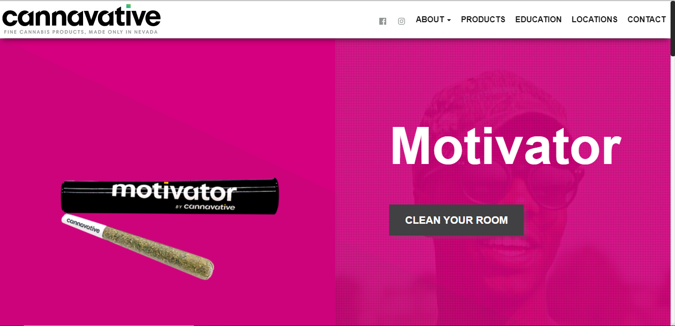
They key is to combine vintage typography or bold colors with modern design so users feel at home while embracing the past. This design we created for our client
Cannavative is a great example of combining retro bold colors with a font that stands out for a clean, eye-catching design.
Horizontal Scroll
Horizonal scrolling fell out of favor with web designers in recent years, but is now making a comeback.
As designers search for ways to cram a lot of visuals into a tiny mobile screen space, horizontal scrolling becomes an optimal solution.
This design element allows users from small screens to scroll down vertically between topics or sections, and scroll horizontal for more on each topic or grouping.
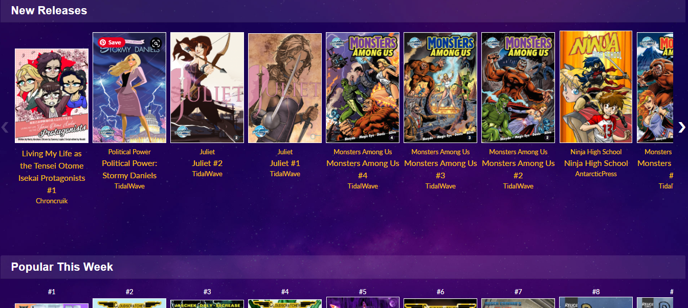
The example below from the
CryptoComics website highlights the use of horizontal scroll in the
Marketplace to show the different genres, and the horizontal scroll allows the user to browse books from within the genres.
Multimedia
Text and images isn’t always enough.
Sometimes a great design incorporates a blend of video, imagery, and even sound to really attract the user and tell the brand’s story.
Storytelling remains a popular trend, and what better way to make an emotional connection than through video?
Just be careful when including multimedia that your website is still optimized for loading speed to retain a great user experience.
Dark Mode
Dark Mode is an increasingly popular design choice.
Many platforms offer the option of light and dark for users, and we are also seeing an increasingly larger amount of designs just completely opting to go dark.
Dark is better for viewing long periods, because it results in lower eye fatigue. It is also better for night-time viewing.
On the aesthetic end, dark mode easily creates an ultra-modern look for your website while giving you the ability to highlight other design elements just by darkening the elements that surround it.
Minimalism
Minimalism, or flat design, has been around for some time, and it is likely here to stay. There is something universally appealing about simple designs, lots of “white space” or empty space, and basic color themes. As other trends come and go, this one has staying power.
Like using bold or retro fonts and text as a hero image, minimalism makes it easy to get your message across quickly, without a lot of fuss. Our client
Diamond Warranty has a beautiful, minimal website that focuses on immediately sharing its message, and helping users with interactive content, such as a warranty calculator.
An added benefit to minimalism is that it looks great on small screens.
Art and Tech
Combining art skills with technological know-how is increasingly important to a successful design. As competition continues to grow with billions of web pages available to browsers, grabbing the attention of web users is more challenging than ever.
Websites that have a design chosen for their target audience, great user experience, and the right framework are going to be more successful in attracting users.
Knowing when and how to use AMP, Bootstrap, meta data, keywords, and optimizing for Core Web Vitals are just as important as color choice, fonts, interactive features, and images.
The tech behind the web design requires an article of its own.
Conclusion
Trends like Parallax, Minimalism, and Multimedia aren't new. They continue to be refined as the tech catches up with the design concepts. Other trends, like Horizontal scrolling and retro colors and fonts are brought back for functionality and nostalgia.